Tips for Choosing Calm Colors to Create a Peaceful Home
Creating a peaceful environment at home often starts with choosing the right colors. Calm colors can transform your living space into a serene retreat, helping you relax and recharge after a busy day. But with so many hues and shades available, how do you pick colors that truly bring tranquility to your space?
In this post, we’ll share helpful tips for choosing calm colors for your home. Whether you’re painting a single room or your entire house, these ideas will guide you toward making choices that feel balanced, cozy, and soothing.
Why Choose Calm Colors?
Colors affect our mood and emotions more than you might realize. Bright, bold colors like red and orange can energize a space, but they might be overwhelming in areas where you want to unwind. Calm colors—such as soft blues, gentle greens, and muted neutrals—encourage relaxation and reduce stress.
Using calming colors in your home can:
– Improve your overall sense of well-being
– Enhance restful sleep in bedrooms
– Create a welcoming atmosphere in living rooms
– Help concentration in workspaces
Understanding Color Basics
Before selecting paint, it helps to understand a little about color theory. Colors are generally categorized into:
– Warm colors: Reds, oranges, yellows. These stimulate energy.
– Cool colors: Blues, greens, purples. These are calming and restful.
– Neutrals: Whites, grays, beiges, and browns. These provide balance.
For a calm environment, cool colors and neutrals are usually your best bet.
Tips for Choosing Calm Colors
1. Start With Soft, Muted Shades
Bright or saturated hues can be visually stimulating. Instead, opt for softer shades of your favorite colors. For example:
– Pale blue instead of bright turquoise
– Sage green instead of neon lime
– Warm beige instead of stark white
These muted shades create a gentle background that won’t demand too much attention.
2. Consider the Room's Purpose
Think about how you’ll use the room, then choose colors that enhance that activity:
– Bedroom: Soft blues, pale lavenders, or warm taupe support rest.
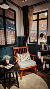
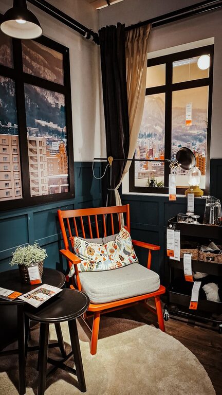
– Living Room: Muted greens and light grays foster calm social spaces.
– Bathroom: Cool aqua or soft seafoam evoke cleanliness and serenity.
– Home Office: Soft neutral shades help focus without distraction.
3. Test Samples in Different Lights
Light dramatically affects how color appears. Paint small swatches on your walls and observe them:
– In natural daylight
– Under artificial light in the morning and evening
You might find a color that looks peaceful during the day feels dull at night—or vice versa. Testing helps avoid surprises.
4. Use Color Psychology Wisely
Certain colors are known for their calming effects:
– Blue: Often called the most relaxing color, it’s associated with calmness and order.
– Green: Evokes nature and renewal, promoting balance and calm.
– Lavender: A soft purple that encourages relaxation and reduces tension.
– Gray: A versatile neutral that can create sophistication without feeling harsh.
Pairing these colors thoughtfully enhances the tranquil vibe.
5. Add Warm Neutrals for Balance
Using only cool colors can sometimes feel chilly. Integrate warm neutrals like cream, taupe, or light brown to add a comforting warmth while maintaining calm. This balance creates inviting spaces that feel both soothing and cozy.
6. Think Beyond Walls: Color Accessories Matter
If you’re hesitant to commit to paint, introduce calm colors through textiles and decor:
– Cushions and throws in soft pastels
– Curtains in muted tones
– Rugs and artwork featuring calming palettes
These elements can layer color subtly without overwhelming the space.
7. Keep It Consistent for Flow
To maintain calm energy throughout your home, choose colors that complement each other. Avoid stark contrasts between rooms by selecting hues within the same color family or using variations of one calming shade. This creates a smooth transition from room to room.
8. Don’t Forget White and Off-White
Clean, soft white shades (think eggshell or ivory) can open up spaces and make them feel airy and peaceful. Avoid harsh, clinical whites that feel cold. Off-white tones are neutral backdrops that let your calming colors shine.
Common Calm Color Combinations to Try
Here are some easy-to-use color pairs that work well in creating calm spaces:
| Combination | Description |
|————————–|————————————————–|
| Soft blue + warm beige | Classic, serene, and inviting |
| Sage green + creamy white| Natural and fresh |
| Lavender + pale gray | Elegant and restful |
| Light aqua + soft taupe | Relaxing and balanced |
| Misty gray + blush pink | Gentle and soothing with a subtle warmth |
Final Thoughts
Choosing calm colors for your home can transform everyday living into a peaceful experience. Remember to consider room purpose, natural lighting, and personal preferences when selecting hues. Don’t rush—test different samples and take your time finding the perfect shade.
By surrounding yourself with thoughtful, calm colors, your home can become a tranquil sanctuary where you feel nurtured and relaxed every day.
—
We hope these tips inspire you to create your own peaceful color palette. Happy decorating!